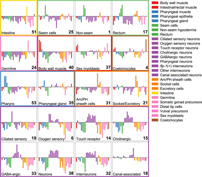
Figure 5.
Topic-specific peaks tend to be near tissue-specific genes. Peaks associated with each topic were mapped to the nearest downstream gene, and the tissue expression distribution of the genes near the top 250 most-specific peaks for each topic was compared with the tissue expression distribution of 250 randomly selected genes. Here we plot the results as the log2 ratio of the topic-associated tissue expression distribution to that of randomly selected genes. Error bars, 95% confidence interval after comparing to the tissue expression distribution of 100 random samples. LDA topic numbers are shown in the bottom right corner of each plot. Topics with similar tissue-specificity patterns are grouped together, and the tissue type names and colors are as in Cao et al. (2017). Tissue assignments were made by eye based on the tissue with maximal fold-change and are written in the bottom left corner of each plot. If no single tissue was clearly the maximum, then a more general tissue annotation was chosen (e.g., “neurons” for topic 38). These annotations may need to be revisited with new data. Note that for concise visualization in this figure, we display just 20 of our 37 topics, but we report a version of this figure with all 37 topics in Supplemental Figure S9. All plots have the same y-axis range, from a log2 ratio of −4.5 to 4.0.

