. 2021 Sep 13;10:e67852. doi: 10.7554/eLife.67852

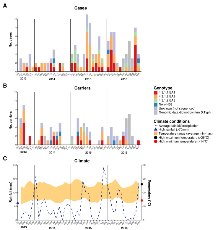
Figure 3. Epidemic curve of all S. Typhi cases and controls per month inside the DSS.

(A) Monthly distribution of S. Typhi genotypes from cases. (B) Monthly distribution of S. Typhi genotypes from carriers. Note that the counts include all participants who were culture-positive for S. Typhi and also those who were culture-positive for other Salmonella but identified later by WGS as S. Typhi. (C) Weather conditions throughout the study period. Blue dashed line indicates precipitation level per month (rainfall), shaded orange polygon indicates the temperature range, red circle indicates threshold for high minimum temperature for statistical testing, black circle indicates threshold for high maximum temperature for statistical testing, blue triangle indicates threshold for high rainfall for statistical testing.

Figure 3.

Figure 3—figure supplement 1. Epidemic curve of all S.Typhi cases and controls per month.

Figure 3—figure supplement 1.

(A) Monthly distribution of S. Typhi genotypes from cases. (B) Monthly distribution of S. Typhi genotypes from carriers. Note that the counts include all participants who were culture-positive for S. Typhi and also those who were culture-positive for other Salmonella but identified later by WGS as S. Typhi. Genotypes are indicated by colour as per inset legend. (C) Weather conditions throughout the study period. Blue dashed line indicates precipitation level per month (rainfall), shaded orange polygon indicates the temperature range, red circle indicates threshold for high minimum temperature for statistical testing, black circle indicates threshold for high maximum temperature for statistical testing, blue triangle indicates threshold for high rainfall for statistical testing.