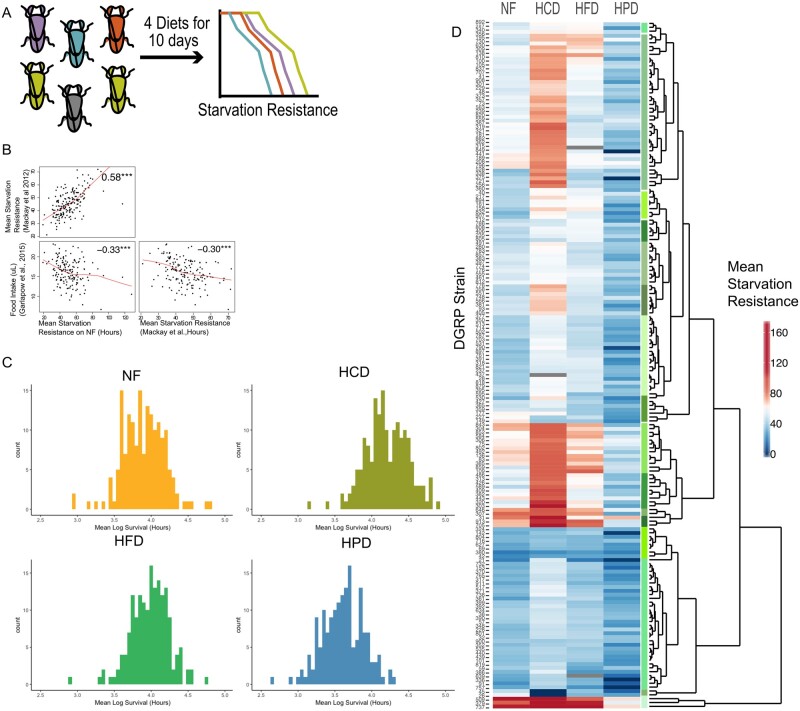
Figure 1.
Inter-strain variation in response to diet. (A) DGRP screen schematic outlines the workflow. Each individually colored fly represents an individual DGRP line and survival curves represent the measured starvation resistance (in hours) after exposure of flies to each diet. (B) A pairs plot showing correlations of the mean starvation resistance data fed the NF diet from this study with previously published starvation resistance data (Mackay et al. 2012) and food intake data (Garlapow et al. 2015). The red lines represent local linear regression (locally estimated scatterplot smoothing) of the correlations. (C) Histograms of the mean Log-transformed starvation resistance data for each strain on each diet. (D) Heatmap and Euclidean hierarchical clustering of the raw mean starvation resistance (in hours) of each DGRP strain on each diet.

