
Figure 2.
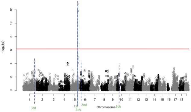
Manhattan plot for the single-locus analysis of the example data. Each point is the strength of association between an SNP and trait. Results are shown for the entire genome. The red horizontal line is the 5% genome-wide significance threshold, calculated via a Bonferroni correction. The blue dashed horizontal lines are the locations of the findings from Eagle. The order in which Eagle found these findings is given below the blue line. Where single-locus association mapping found only a single region of interest, because of Eagle’s increased statistical power, Eagle found five regions of interest.