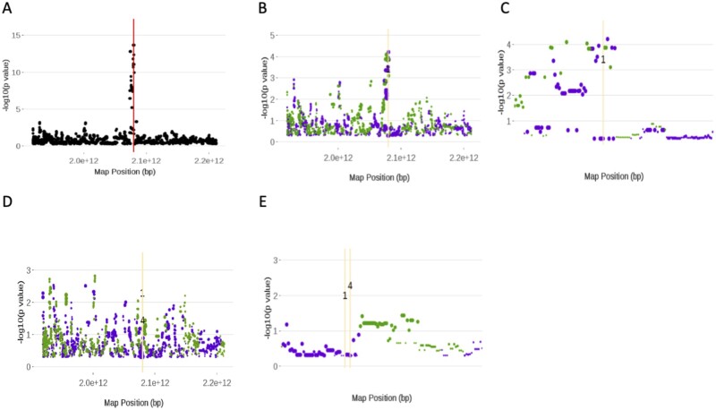
Figure 5.
Screenshots of the plots from running the Eagle function PlotAM. All plots are Manhattan plots and are of chromosome 5. These plots show how the significance of the SNPs changes throughout the model building process. The red vertical line is the position of the SNP that has the largest score statistic and strongest association with the trait at that iteration. The orange vertical lines are the positions of SNPs found in previous iterations to be in strongest association with the trait. Green (purple) points denote SNPs that have increased (decreased) in significance from the previous iteration. The size of the point is proportional to the size of the change in significance. Images (A), (B), and (D) are plots of the first, second, and fifth iterations, respectively, of the model building process. Images (C) and (E) were created from (B) and (D), respectively, by using PlotAM’s interactive zoom feature.

