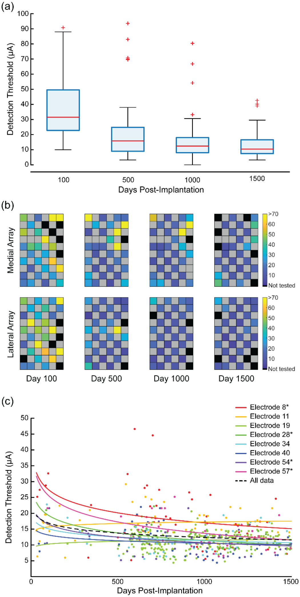
Figure 4.

Detection thresholds for stimulated electrodes since implantation. (a) Box plots of the median detection threshold values from four different time points. (b) Detection thresholds for each electrode are shown on the stimulation arrays as a heat map. Black spaces represent electrodes that were not tested. Grey spaces represent electrodes that were not wired due to technical constraints. The color bars show the detection threshold values in microamperes. (c) Detection thresholds for eight electrodes over time. Each point represents an individual threshold for a single electrode and the color represents a specific electrode as indicated in the legend. Asterisks on the legend identify electrodes with statistically significant changes over time. Lines were fit to the data for each electrode using regression of the log-transformed data. The fits were reverse transformed for plotting. The dotted black line shows the regression for the aggregate detection data.
