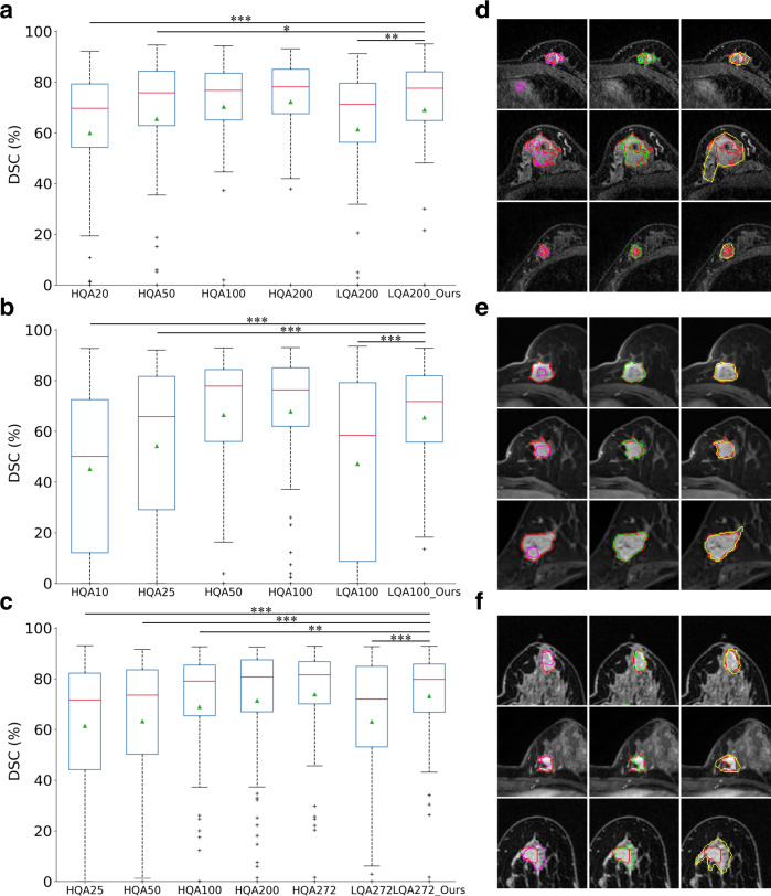
Fig. 4. Results of breast tumor segmentation.
a−c Results on GGH, GPPH, and HPPH datasets, respectively. LQA and HQA indicate low- and high-quality annotations. The numbers after HQA refer to the annotations utilized to train the models. For LQA, the numbers indicate that we utilize the respective fewest HQA data with the remaining annotations generated by the pretrained models. For example, LQA200 in (a) means 20 high-quality labeled and 180 low-quality labeled data are utilized. Data are represented as box plots. The central red lines indicate median DSC values, green triangles the average DSC values, boxes the interquartile range, whiskers the smallest and largest values, and data points () outliers. * indicates a significant difference between the corresponding experiments, with ***, **, and * (two-sided paired t test, independent patient cases). a Between HQA20 and LQA200_Ours, ; between HQA50 and LQA200_Ours, ; between HQA100 and LQA200_Ours, ; between HQA200 and LQA200_Ours, ; between LQA200 and LQA200_Ours, . b Between HQA10 and LQA100_Ours, ; between HQA25 and LQA100_Ours, ; between HQA50 and LQA100_Ours, ; between HQA100 and LQA100_Ours, ; between LQA100 and LQA100_Ours, . c Between HQA25 and LQA272_Ours, ; between HQA50 and LQA272_Ours, ; between HQA100 and LQA272_Ours, ; between HQA200 and LQA272_Ours, ; between HQA272 and LQA272_Ours, ; between LQA272 and LQA272_Ours, . d−f Visualizations of segmentation maps on the three datasets. The three columns correspond to the results of LQA, LQA_Ours, and independent radiologists. Red contours indicate the high-quality annotations. Magenta, green, and yellow contours are the results of LQA, LQA_Ours, and the independent radiologists.

