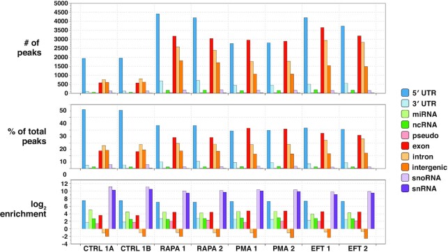
Figure 3.
capCLIP bioinformatic data. Peak calls from each of the six individual capCLIP sequencing datasets (x-axis) are categorized into 10 separate transcript/genome features indicated in the figure’s legend and plotted across three separate bar graphs. The top graph displays raw peak numbers for each of the 10 transcript/genome features. In the middle graph, the percentage of peaks in each dataset assigned to each of the 10 transcript/genome features is plotted. The bottom graph displays peak data according to the log2 enrichment per transcript/genome feature (the number of actual peaks per feature versus the number of peaks expected based on the relative fraction of the specific feature occupies in the human genome).

