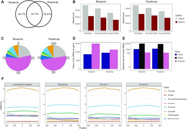
Figure 8.
(A) The Venn diagram illustrates the overlap of genes for which a model could be learned using StitchIt on either one of the datasets used. (B) Number of overlaps between StitchIt REMs and GWAS sites, number of unique GWAS SNPs overlapping with StitchIt REMs and number of unique StitchIt REMs overlapping a GWAS site using the actual GWAS catalog (grey) and 100 randomly sampled SNP sets (red) . (C) The distribution of a mapping of StitchIt sites to the ERB and OCHROdb is shown for Blueprint and Roadmap samples. (D) Number of genes where the StitchIt REM with the highest regression coefficient is either known or unknown. (E) Number of genes where either known, or unknownStitchIt REMs are enriched sorted according to the top absolute regression coefficients. (F) H3K27ac signal shown for randomly shuffled regions, as well as StitchIt regions split according to the categories obtained from intersecting all StitchIt segments with the ERB and OCHROdb. H3K27ac signal is shown for four Blueprint samples in a window of 1kb centered in the middle of the putative REMs. StitchIt regions overlapping Promoter or Promoter Flanking Regions show the highest H3K27ac signal, while the signal in randomly determined regions is the lowest. The largest portion of regions, labeled as unknown have a similar signal intensity as sites labeled as a TF binding site or Open Chromatin.

