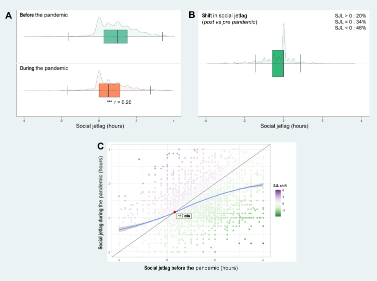
Figure 1.
Difference in social jetlag before and during the COVID-19 pandemic in the studied 14 regions.
Notes: (A) Social jetlag before and during the COVID-19 pandemic; (B) Social jetlag change. Boxplots (solid lines) illustrate the median and interquartiles; whereas violin plots (dashed lines) illustrate the data distribution; (C) Scatterplot of social jetlag before (x-axis) versus during (y-axis) the pandemic. The change in social jetlag is represented by the plot colors purple, green and white for positive, negative and no change, respectively; LOESS smoothed line in blue; No change in SJL also represented by the diagonal black line; the orange circle indicates the intercept between LOESS regression and diagonal line. ***P<0.001, Wilcoxon signed-rank test; r: effect size.

