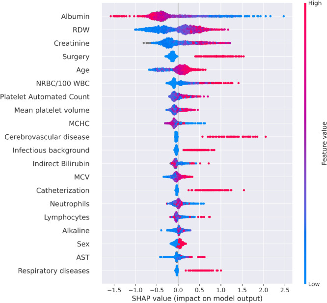
Figure 5.
A summary plot of the SHAP values for each feature of the compact model. From top to bottom, features are ordered by their overall influence on the final prediction (sum of SHAP values). In each feature (line), each point represents a specific case (individual), with colors ranging from red (high values of the predictor) to blue (low values of the predictor). Gray points signal missing values. A point’s location on the X-axis represents the SHAP value—the effect the variable had on the prediction in a given individual. The points further to the right indicate that for the given individual, the covariate contributed to increasing the risk. Points to the left indicate that the covariate contributed to decreasing the risk. The vertical line in the middle represents no change in risk. Values for the feature ‘Sex’ are 0 for female, and 1 for male.

