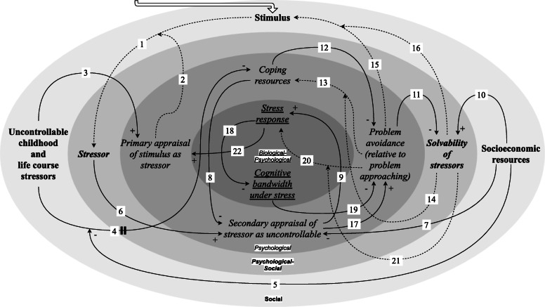
Fig. 1.
Causal loop diagram. Positive (+; an increase in the first variable causes an increase the second) and negative (−; an increase in the first variable causes a decrease in the second) causal links are marked accordingly. Changeable causal links (i.e. without a fixed positive or negative polarity) are depicted as dashed arrows, where the polarity or strength of the effect is dependent on the variable at the tail of the intercepting changeable causal link (link 1/2, 4/5, 13/14, 15/16, 20/21). The perpendicular double line on link 4 signifies that this causal link acts on a considerably different temporal scale than the other causal links. The biological, psychological and social spatial scales are visualised as underlined, in italics and in bold, respectively, and are depicted as different layers indicated by various shades of grey. Combinations are also demonstrated. We included the variable “stimulus” in the social spatial scale because the nature of the stimuli that people are exposed to is intertwined with exposure to adverse socioeconomic conditions [6, 14]

