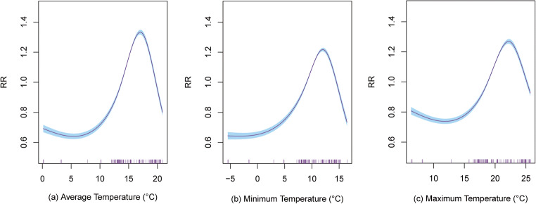
Fig. 3.
The smoothing plot between average temperature (a), minimum temperature (b), and maximum temperature (c) with the number of confirmed COVID-19 cases. The y-axis is relative risk (RR) calculated by exponenting the coefficient of temperature and the x-axis denotes temperature in study period. The vertical purple short line on x-axis represents the daily distribution of temperature during the study period. The blue shading in the graph represents the 95% confidence interval of the curve

