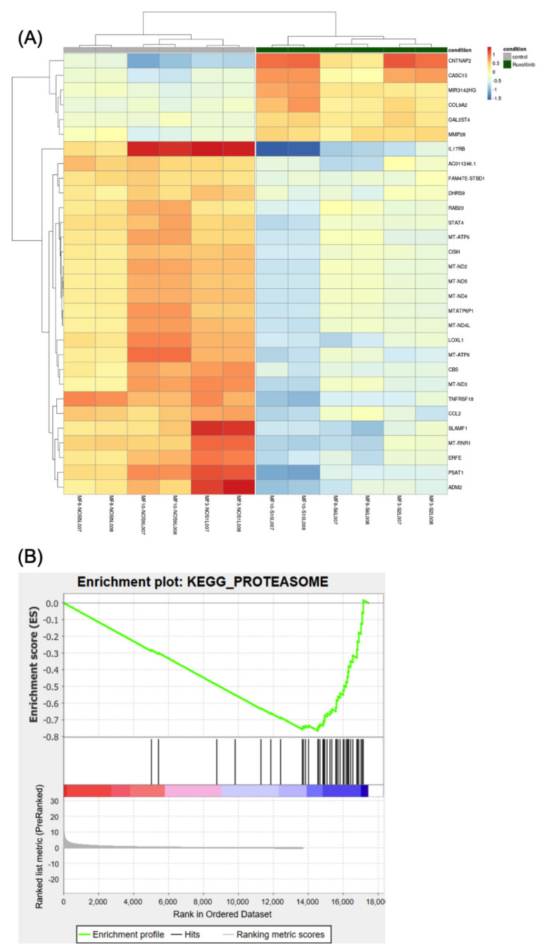
Figure 5.
The differential expression analysis. (A) Heatmap showing the 30 most statistically relevant genes which are differentially expressed between the ruxolitinib-treated cells and the untreated control. The heatmap is organized into two parts grouping the untreated samples (the first 6 columns on the left side of the heatmap, also indicated by a grey bar at the top of the heatmap) from the treated samples (the remaining 6 columns of the heatmap, also indicated by a dark-green bar at the top). The heatmap provides clustering both on the rows (genes) and between the columns (samples). (B) Plot reporting the profile for the Enrichment Score (ES) of the proteasome gene set members. The gene set members are represented as black bars. They are listed in order of ES, that is the genes at the left side are the most upregulated, whereas the ones on the right side are downregulated. The figure shows that most of the dysregulated genes in the proteasome pathway (gene set) are downregulated.

