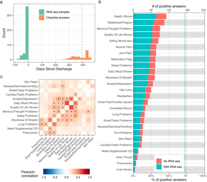
Figure 2: Description of PASC checklist items.
a) Histogram of the timing of blood sampling and PASC checklist completion. The x and y axes are the number of days since discharge and a count of observations respectively. The green bars are counts of RNA-seq samples and orange bars the number of days between COVID-19 hospitalization discharge (black dashed line) and PASC checklist completion (dashed orange line is the median). b) Prevalence of PASC checklist items in our cohort. The y axis is symptoms, the upper and lower x axes are the number of positive answers and percentage of subjects from the entire cohort with a positive answer, respectively. The blue line represents the subset of subjects with RNA-seq who completed the checklist. The dashed black line is the cutoff used for inclusion in follow up analyses. c) PASC checklist item correlations. The axes are representative of the symptoms of interest (Methods) and the color the Pearson correlation of their coincidence. Correlations with family wise error rate (FWER, Holm 1979) adjusted p values < 0.05 are indicated with a star. Rows and columns are ordered to minimize distance between adjacent symptoms.

