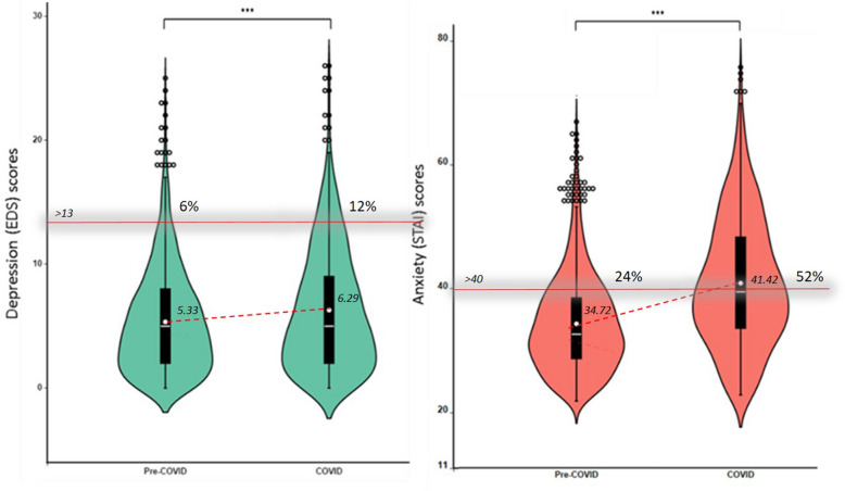
Figure 2.
Violin plots illustrating the scores on depression (green) and anxiety (orange) in the pre- and during- COVID-19 samples. The distribution of the data is represented by the violin shape, with larger width indicating higher value frequency. The mean of each group is represented by the dot, whereas the horizontal bars represent the minimum, the median and the maximum values. The whiskers represent the first and the fifth quantile. The dots represent outlier scores. The percentage of women above the clinical cut-off > 13 for depression and > 40 for state anxiety in the Pre-COVID and the COVID sample is noted above the cut-off line. ***p < .001.

