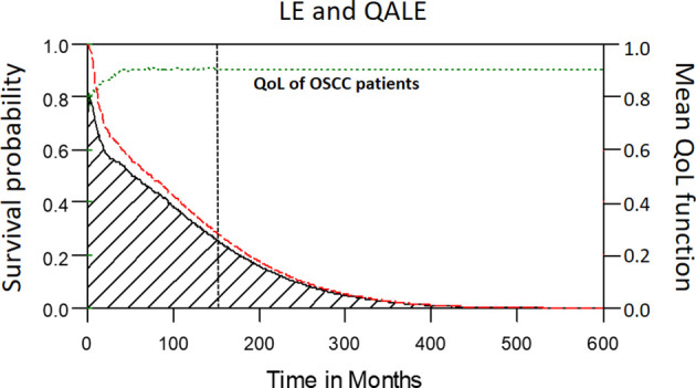
Figure 2.

The mean QoL (utility) function (green dashed line) was multiplied with the corresponding lifetime survival probabilities (red dashed line) to obtain the quality-adjusted survival curve (black solid line). The area under the red dashed line is the LE. The area under the black solid line is the QALE. The vertical black dotted line stands for the starting month of extrapolation.
