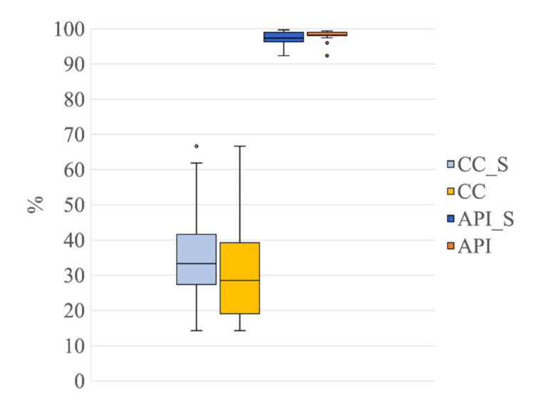
Figure 10.
Distribution of CC and API for the group G1s in comparison to group G1 (both groups separated into 21 ICs). Box plots of the percentage of contaminated ICs (CC_S, in light blue, refers to G1s; CC, in light yellow, refers to G1) and of the Artefactual Percentage Index (API_S, in blue, refers to G1s and API, in yellow, refers to G1). The horizontal black lines, the boxes, the vertical bars, and the dots indicate the median, the 25–75 percentile, the 5–95 percentile, and the outliers, respectively.

