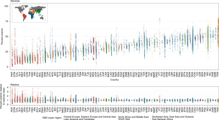
Fig. 3. Geographical inequality in overall anemia among WRA across 82 countries for 2000 and 2018.
a, Absolute inequalities: range of overall anemia estimates in WRA in second administrative-level units within 82 LMICs. b, Relative inequalities: range of ratios of overall anemia estimates in WRA in second administrative-level units relative to country means (administrative level/country level). Each dot represents a second administrative-level unit. The lower bound of each bar represents the second administrative-level unit with the lowest overall anemia in WRA in each country. The upper end of each bar represents the second administrative-level unit with the highest overall anemia in WRA in each country. Thus, each bar represents the extent of geographic inequality in overall anemia in WRA estimated for each country. Bars indicating the range in 2018 are colored according to their GBD super-region48 (Extended Data Fig. 3). Gray bars indicate the range in overall anemia in WRA in 2000. The black diamond in each bar represents the median and mean overall anemia in WRA estimated across second administrative-level units in each country and year for the absolute (median) and relative (mean) inequalities plots. A colored bar that is shorter than its gray counterpart indicates that geographic inequality has narrowed.

