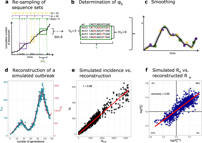
Fig. 1. Reconstruction of incidence histories using the proposed method.
a–c Schematic of the incidence reconstruction method. a The sequences are chronologically ordered by collection date. The line shows the cumulative sum of sequences over time. The sequences are allocated into temporal bins, spanning either the same time frame Δdb (yellow and purple bins) or containing the same amount of sequences (green bins). b For each bin, the number of distinct variants hb, as well as the total amount of mutant sequences mb are used to infer the incidence correlate ϕb. c The point estimates for all bins ϕb (dots) are smoothed with a convolution filter. For uncertainty estimation, the point estimates are sub-sampled and interpolated and 95% confidence intervals highlighted. d–f Reconstruction of a simulated outbreak with GInPipe. d ϕ estimates resemble the underlying population dynamics over time. The blue line shows the smoothed median of the sub-sampled ϕ estimates (dots) for a simulated outbreak. The red line indicates true incidence per generation. e Dotplot showing the true outbreak size from the simulation Ntrue versus the ϕb point estimates for 10 stochastic simulations. The red line depicts the linear fit. f The reconstructed incidence correlates ϕ allow the determination of the effective reproductions rate Re as described in the Methods section. The dotplot shows (inferred from the true population size Ntrue) versus (constructed with correlate ϕ) on log scale for the 10 stochastic simulations. The red line shows the linear fit. The proportion of points in each quadrant is shown in the respective partition.

