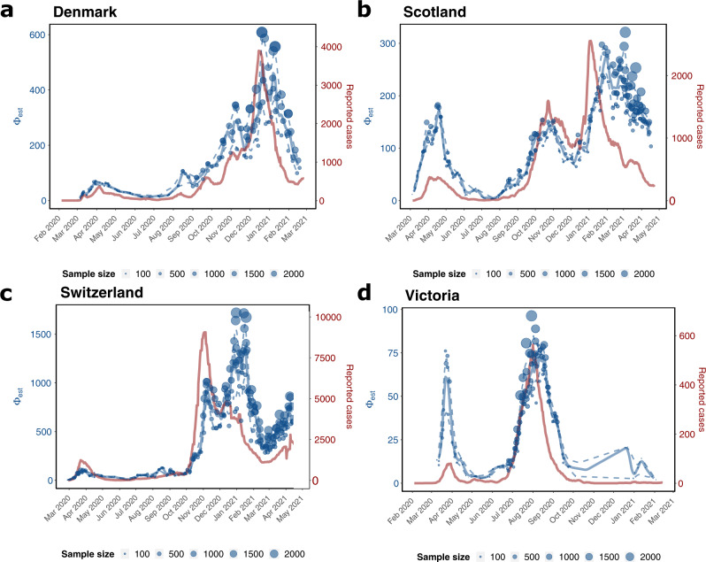
Fig. 3. Incidence reconstruction based on sequencing data.
The graphic depicts the genome-based incidence reconstruction in blue using the proposed method (left axis) vs. the 7 days rolling average of newly reported cases in red (right axis). Blue dots depict ϕb point estimates of the incidence correlate, where the size of the dot is related to the number of sequences used to infer ϕb. The solid and dashed blue lines denote the median smoothed trajectories and their 5th and 95th percentiles. The black markers on the x-axis depict the collected sequences at the given dates. a Denmark (n = 40.575 sequences) b Scotland (n = 30.258 sequences), c Switzerland (n = 25.779 sequences), d Victoria (n = 10.710 sequences).

