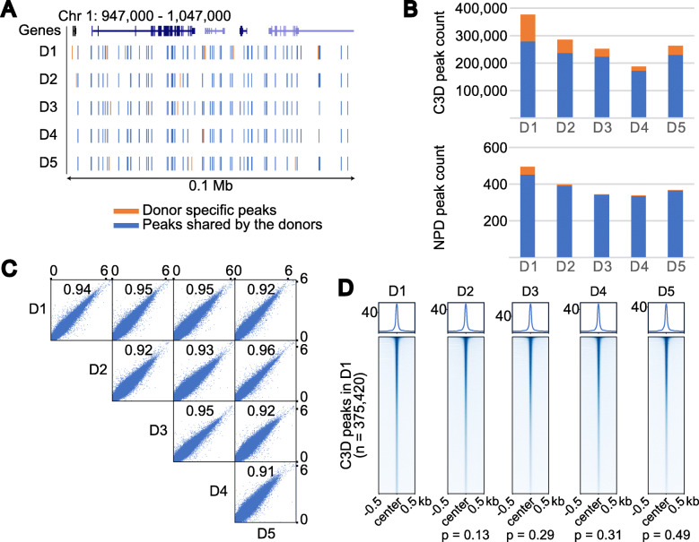
Fig. 4.
C3D peaks are shared among individuals. A A browser shot comparing C3D peaks among five healthy donors. The peaks shared between at least two donors are shown in blue, whereas those specific for a certain individual are shown in orange. B Total number of C3D and NPD peaks for each donor. Blue and orange indicate peaks shared by two or more donors and donor-specific peaks, respectively. C A scatter plot matrix comparing the normalized read coverage of C3D peaks between two donors. The correlation coefficients are indicated in each plot. Both axes are on a base-10 logarithmic scale. D Aggregation plots of the normalized read coverage for C3D peaks. C3D peaks are sorted according to the normalized read coverage in donor 1 (D1). This order is maintained in the aggregation plots for D2 to D5. Correlation coefficients obtained using the Wilcoxon rank-sum test are shown at the bottom

