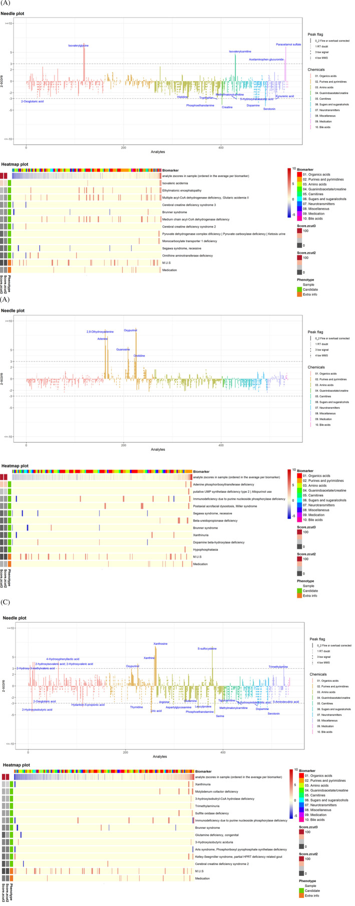
FIGURE 3.

Representative needle plots and heatmaps. A, Isovaleric aciduria with isovaleryl carnitine and isovaleryl glycine as primary metabolites, B, APRT deficiency with a prominent 2,8‐dihydroxyadenine peak, C, molybdenum cofactor deficiency with S‐sulphocysteine, xanthosine, xanthine and oxypurinol. Needle plot—The z‐scores of all unique metabolite/analyte combinations are plotted. The chemical category of the metabolite is color coded. The peak score is visualized by different line styles. Solid line = analytes with a reliable peak integration. Three types of dashed lines = score 1, 3 or 4, implying a doubtful analytical peak. The metabolites/analytes are sorted by metabolite category and name. The z‐score cut‐off = 3 is shown here and indicated as a dotted line in the plot. Metabolites whose analyte (ion) reaches a |z‐score| above the cut‐off is labeled. Heatmap plot—The first line of the heatmap shows the distribution of the metabolites in the sample. The metabolites are colour coded by chemical category. The second line shows the z‐score profile of the sample (increased metabolites are shown in red and decreased metabolites in blue). The theoretical z‐score profiles for the candidate phenotypes are plotted underneath. The left two columns show the phenotype match scores (colour scale: more reddish indicates a higher matching score) at cut‐off = 2 and cut‐off = 3. The corresponding phenotype names can be read on the right
