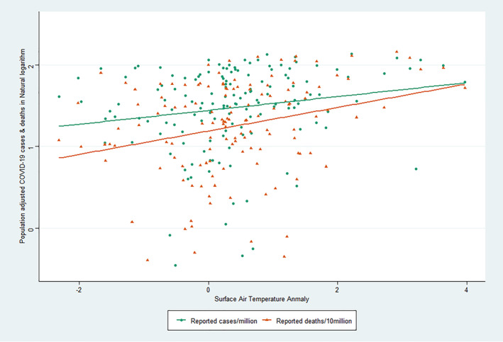
Figure 4.

Scatterplot showing the distribution of surface air temperature anomaly and COVID‐19 cases and deaths (in natural logarithm). The scatterplot shows a positive correlation between the population‐adjusted number of COVID‐19 cases and deaths with the temperature anomaly.
