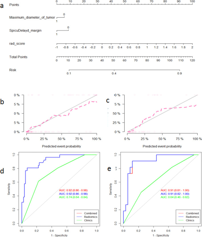
Figure 4.
Decision curve analysis of various models for NAC sensitivity (a) and probability of achieving pCR (b), respectively. The x-axis indicates the threshold probability and the y-axis indicates the net benefit. The red and green lines represent the net benefit of the nomogram and clinical factor models, respectively. The radiomics model shows the highest net benefit.

