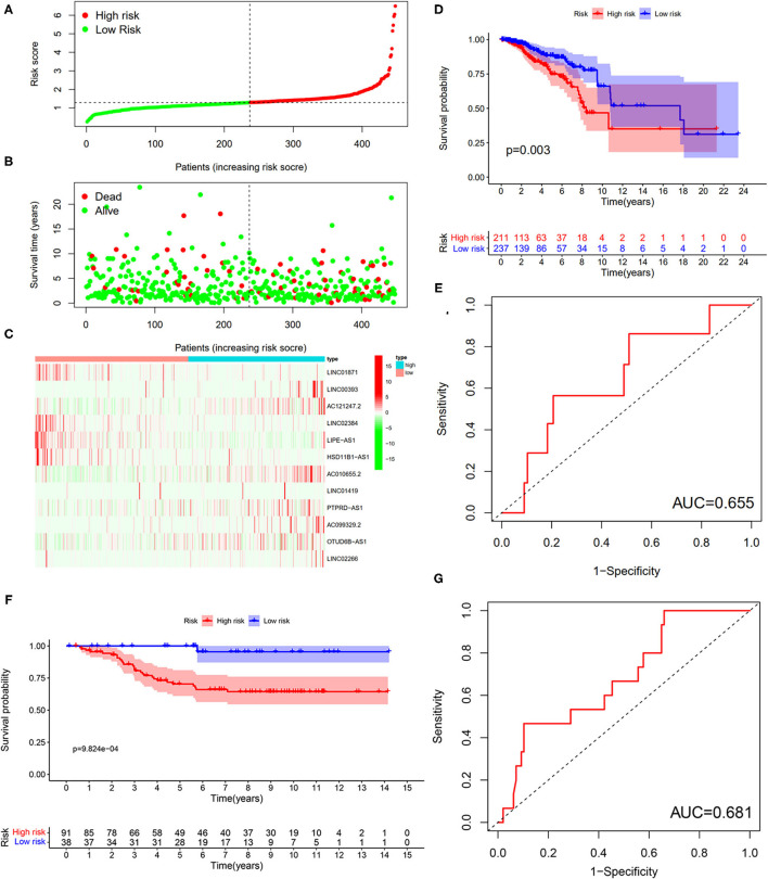
Figure 10.
Testing for the 12-LncRNA signature. (A) The distribution of risk score; (B) the survival time and status of patients; (C) the bottom shows the heatmap of 12-LncRNA expression profile. Colors from red to green indicate decreasing the expression level from high to low; (D) the K–M curves for high- and low-risk groups. Purple color represents the low-risk group, whereas red color represents the high-risk group; (E) ROC curves for patients with BC in the testing set. (F) The K–M curves for the high- and low-risk groups in GSE69031 cohort. Purple color represents the low-risk group, whereas red color represents the high-risk group; (G) ROC curves for patients with BC in GSE69031 cohort. AUC, area under the curve.

