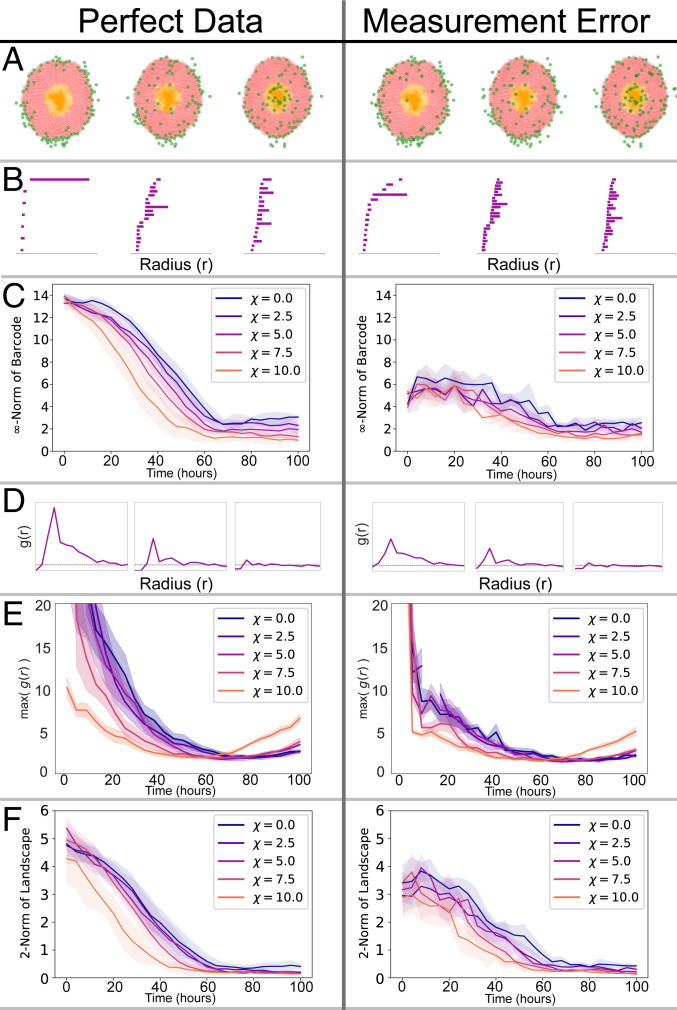
Fig. 1.
We apply 1-PH, the PCF and MPH to ABM data (Left) and to ABM data with falsely registered cells (Right). (A) Cell distributions at three time points from an ABM simulation. The green cells denote macrophages, the red cells denote viable tumor cells, and the orange cells are necrotic tumor cells. There are macrophages and falsely registered cells. (B) The barcode for each snapshot of the simulation. A bar in the barcode corresponds to a loop formed by the macrophages (green). Longer bars correspond to larger loops. (C) 1-PH decay curves tracking the length of the longest bar in the barcode against time for simulations with different chemoattractant sensitivity parameter . The curves show the average curve with standard deviation (SD) bands, computed with five simulations for each value of . Without noise we separate the distinct chemotaxis parameters. The decay curves are significantly disrupted by the introduction of measurement noise. (D) The PCF, for each snapshot of the simulation. The horizontal dashed line at is indicative of randomly distributed cells. suggests clustering of macrophages at distance from one another; suggests dispersal. (E) Curves tracking the maximum value of the PCF throughout the simulation (mean and SD of five simulations). The curves show that macrophages become less clustered as they begin to infiltrate the spheroid. Curves at high show more clustering toward the end of simulations, as macrophages reach the spheroid core and become more clustered again. In the presence of measurement noise, these patterns become less clear and are difficult to interpret. (F) MPH decay curves tracking the 2-norm of the MPH landscape against time. The MPH decay curves are less impacted by the measurement error. In C, E, and F, corresponds to the time at which macrophages are introduced into the simulation.

