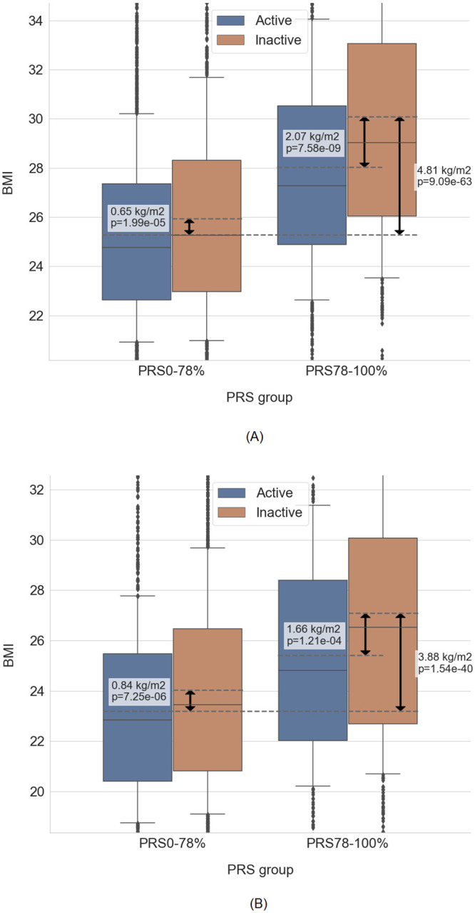
Fig 4. BMI distribution of individuals, stratified by PRS groups and levels of physical activity.

(A): Discovery Inter99 dataset. (B): Validation in Genotek dataset. Graphs are cut at 10% / 90% quantiles on the y-axis (note the different scales on the panels). Solid lines represent median, boxplot outlines represent 25% / 75% quantiles, whiskers represent 10% / 90% quantiles. Dashed lines represent the mean of the respective box, which were compared in the statistical test. The difference in mean values and p-value of respective tests are shown on the plot. Both graphs show BMI, unadjusted for age and sex. Adjusted BMI residuals and outliers are available at Online Supplementary.
