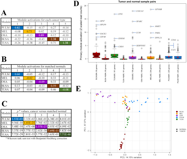
Fig 3. Comparison of module activations between cancer and normal samples.
(A) Module activations for each of the 5 cancers studied. (B) Module activations of matched normal controls. (C) Module activation p values for comparison of cancer sample activation with normal sample activation. Colored entries in (A)-(C) mark the values for the primary modules of each cancer type. Primary modules are defined as the highest expressed module with p < 0.05 for each cancer type. The primary modules are: module 1 (blue) for PULM, module 2 (orange) for MEL, module 3 (purple) for OSA, module 4 (brown) for BLSA, and module 5 (green) for TLSA. (D) Box plots showing distributions of primary module gene activations for each cancer and matched normal (Eq (3)). Open circles are oulier points. Some of the outlier points associated with the tumor samples are labeled with representative genes from each module. Red diamonds locate positions of the average activation across all genes within each module and all samples representing each cancer (Eq (5)). The center of each notch is the position of the median activation. (E) PCA plot showing positions of cancer samples (circles) and associated matched normals (squares). Each sample is represented by a set of 5 module activations, each activation compiled as an average across all genes of each module.

