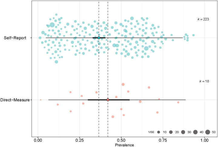
Figure 2.
Orchard plot of taste loss and COVID-19. The point estimate of the pooled prevalence (trunk) is represented by the bold turquoise or pink dot. The confidence interval of the pooled prevalence estimate (branch) is represented by the bold black line, and the prediction interval (twig) is represented by the thin black line. Individual prevalence estimates from each study are represented by the scattered colored points (slightly transparent circles). Each point is scaled by the precision of the point estimate of prevalence for each study, i.e., inverse of the standard error.

