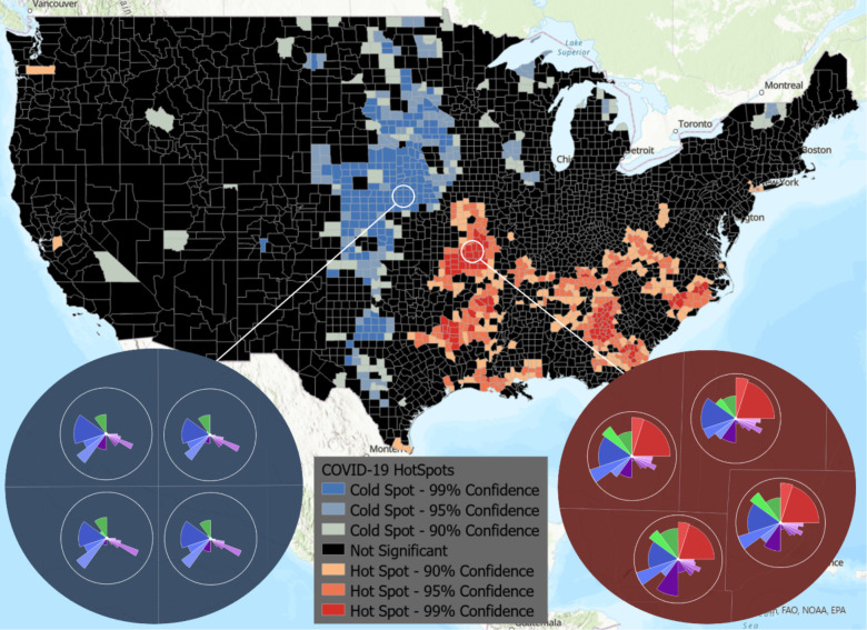
Figure 5.
Hotspot analysis provided by ArcGIS integrated with the ToxPi*GIS Toolkit. A national view of hotspots and coldspots is shown, where color represents high-risk (hotspot) and low-risk (coldspot) areas. The two insets show ToxPi images for example coldspot (blue) and hotspot (red) counties with a 99% confidence level, providing an easy means of visually comparing the areas based on slice scores.

