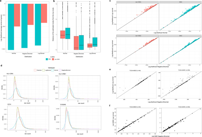
Fig. 2. Comparison of normal, negative binomial, and log-normal distribution in fitting linear-scale gene expression data.
a A bar chart of average log-likelihood of the three types of distribution fitted to PBMC single-cell RNA-seq data. The genes were split by DEGs (red; n = 1723) and non-DEGs (blue; n = 1496). b Comparison of the distance of the estimated mode to the true mode (y-axis) per distribution type (x-axis). The standard boxplot notation was used (lower/upper hinges— first/third quartiles; whiskers extend from the hinges to the largest/lowest values no further than 1.5 * inter-quartile ranges). c Pairwise comparison of per-gene log-likelihood of log-normal distribution (y-axis) and that of normal (x-axis; top) and negative binomial distribution (x-axis; bottom). The genes were split into non-DEGs (left) and DEGs (right). d Density plots for raw-counts (red) and optimized log-normal (green), normal (blue), and negative binomial distribution (purple) for four example genes (gene name at the top) with low maximum log-likelihood for normal distribution. e, f Maximum log-likelihood values (e) and root mean squared error (root MSE: f) of each gene for log-normal (y-axis) and negative binomial (x-axis) convolutions of T = 8 cell types, applied to TCGA-MESO (left) and TCGA-SARC (right) data.

