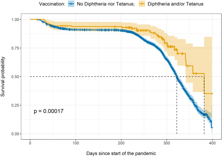
Figure 2.
Kaplan Meier curve. The figure shows the survival probability over time and confidence intervals for two groups: those participants with a vaccination record of diphtheria and/or tetanus (in yellow) versus those participants with no diphtheria or tetanus vaccinations in their records (in blue). The x-axis indicates the number of days since the start of the pandemic in the UK, the y-axis indicates the survival probability. The dotted lines indicate the median survival time for each group. p = p-value.

