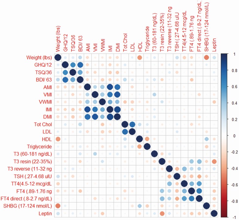
Figure 4.
A visualization of the pairwise correlation matrix between the various dependent measures, collected during treatment A. Positive correlations are displayed in blue with negative correlations displayed in red; the size of the circle and the intensity of the color denotes correlation strength. The diagonal is marked with a straight line of solid blue circles.

