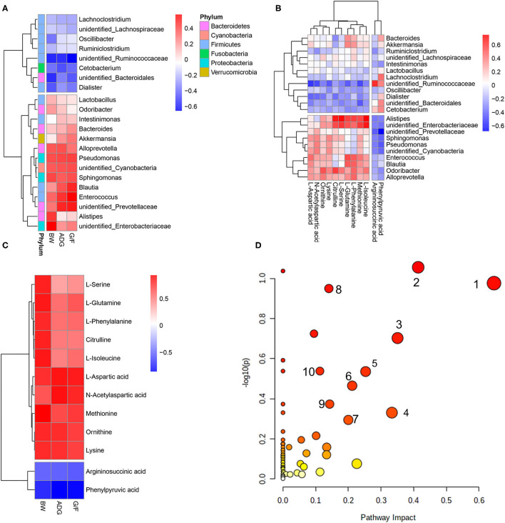
Figure 4.
Correlations between (A) bacteria in which the relative abundance was more than 0.5% and performance parameters, (B) differential metabolites and bacteria, and (C) differential metabolites and pathways that differed significantly (p < 0.05) and performance parameters. Each row in the graph represents a metabolite, each column represents a performance parameter, and each lattice represents a Pearson correlation coefficient. Red represents a positive correlation, while blue represents a negative correlation. (D) Pathway analysis of differential metabolites. The manipulated metabolic pathways are based on the analysis of differentiated ruminal metabolites of donkeys fed HE or LE diets following the Bos Taurus KEGG pathway database. The metabolome view shows all matched pathways according to the p-values from the pathway enrichment analysis and impact values from the topology analysis. The node colors varied from yellow to red, indicating that the metabolites have in the data with different levels of significance. 1, Aspartate metabolism; 2, urea cycle; 3, cardiolipin biosynthesis; 4, glycerol phosphate shuttle; 5, glycerolipid metabolism; 6, arginine and proline metabolism; 7, malate–aspartate shuttle; 8, ammonia recycling; 9, amino sugar metabolism; 10, histidine metabolism.

