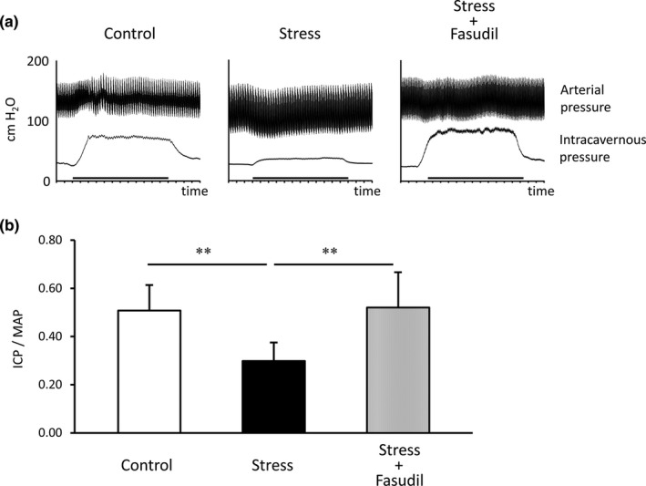
FIGURE 4.

Representative ICP and AP results. Charts show ICP and AP during electrostimulation (bold bar) in each group of rats (a). The EFS period is shown by the thicker bar. ICP to MAP ratios in each group rats were measured (b). Data are reported as means ± standard deviations (n = 8/group). **p < 0.01 using Bonferroni's multiple t‐tests. ICP, intracavernous pressure; MAP, mean arterial pressure
