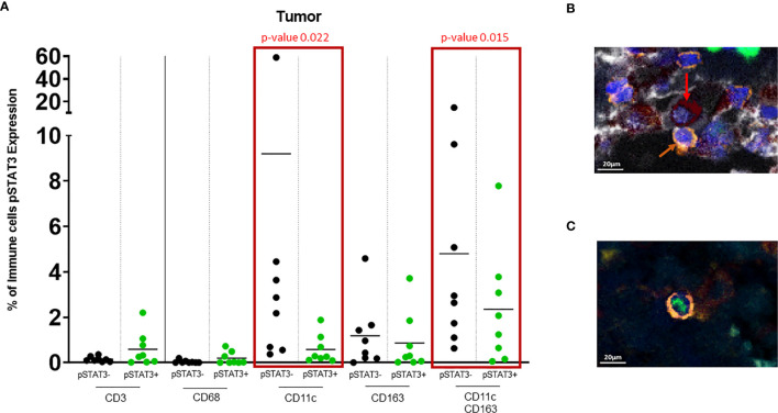
Figure 3.
(A) Dot plot showing % of pSTAT3- vs pSTAT3+ cells in the tumor area. Green circles represent pSTAT3+ populations and black circles represent pSTAT3- populations. Each circle represents a specimen. Red-outlined rectangles highlight the significative comparisons with p-values ≤ 0.05. CD11c+pSTAT3- cells and dual CD11c+CD163+pSTAT3- cells are significantly higher relative to CD11c+pSTAT3+ cells (p=0.022) and CD11c+CD163+pSTAT3+ cells (p=0.015) respectively. The other immune cell populations do not show any significant difference. (B) In tumor stroma, pSTAT3- T cells (orange arrows) can be seen in tight proximity to CD11c+CD163+pSTAT3- cells (red arrows). (C) pSTAT3+ T cell isolated in tumor.

