Figure 4.
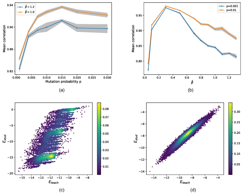
Simulated experiments varying the mutation rate and the selective pressure. In the top panels, the Pearson correlation between true and predicted fitness or equivalently teacher and student model energy are shown. In order to estimate statistical fluctuation on the correlation, for each point, several experiment replica have been realized (), reporting the mean and standard deviation. In panel (a), the mutation rates for two choices of the selective pressure are compared: (blue); (orange). Conversely, in panel (b), the selective pressure at two fixed mutation rates is shown: (blue); (orange). An optimal mutation rate seems to emerge with the mean Pearson coefficient, which flattens for higher mutation rates. Again, performances appear to decrease with increasing selective pressure. Moreover, the curve coinciding with displays significantly higher correlations. The bottom panels show two examples of a density scatter plot between true (x-axis) and inferred (y-axis) energies over the test set. Two limiting cases are shown: high selective pressure and low mutation rate in panel (c) ( and ) and low selective pressure and high mutation rate in panel (d) ( and ), where AMaLa recovers the right fitness landscape. In the former case, the Pearson’s correlation is , while in the latter, it is .

