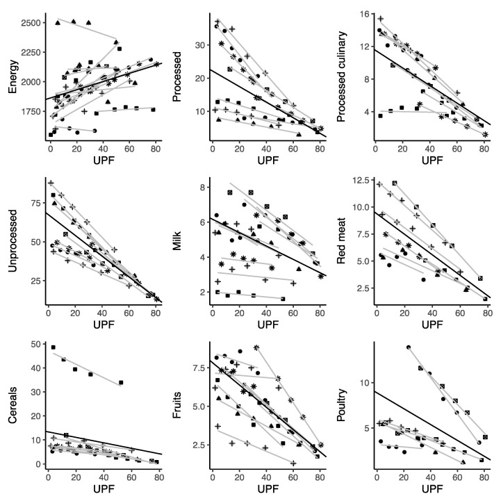
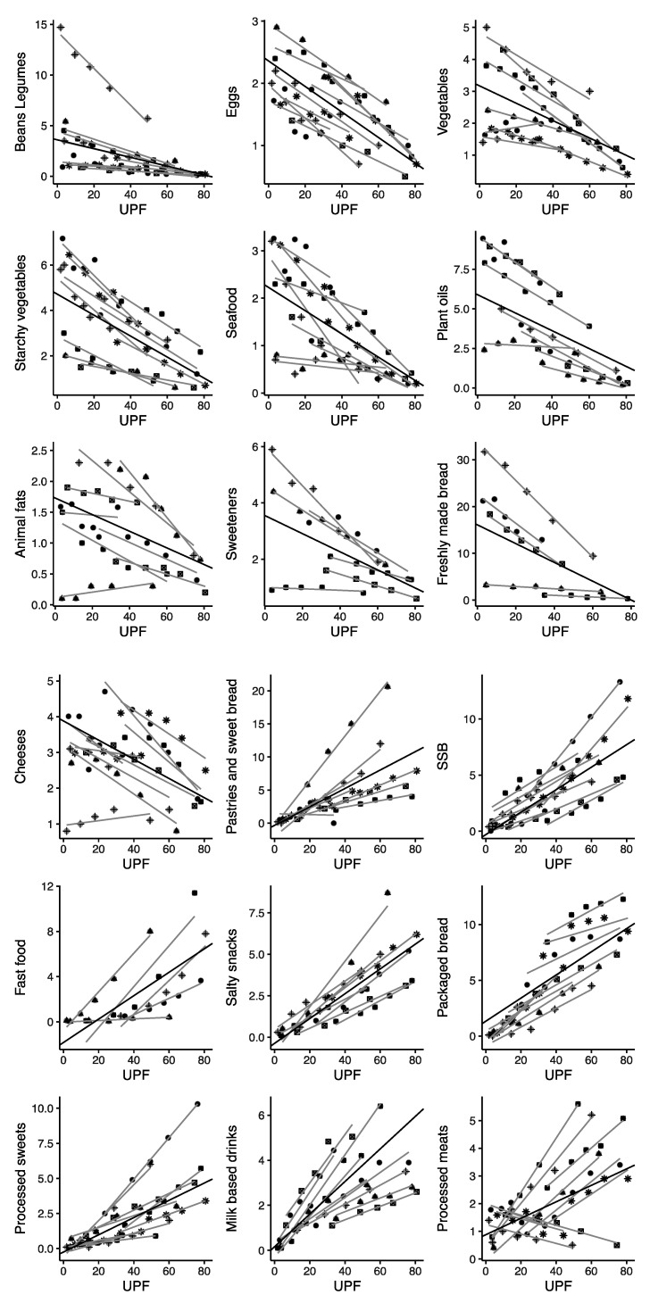
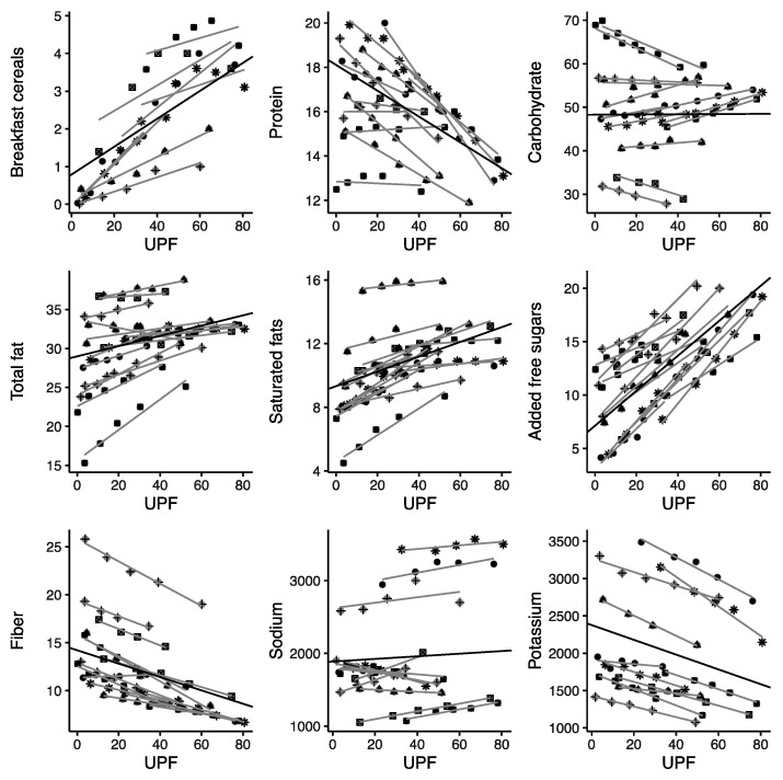
Figure 2.
Scatter plots for the correlation between ultra-processed food consumption and selected food items in nationally representative samples. Symbols represent different cohorts; light lines represent linear regression coefficients of individual studies; bold lines represent summary estimates of the average variation in each food item for a 1% increase in ultra-processed food intake (as a percentage of daily energy).


