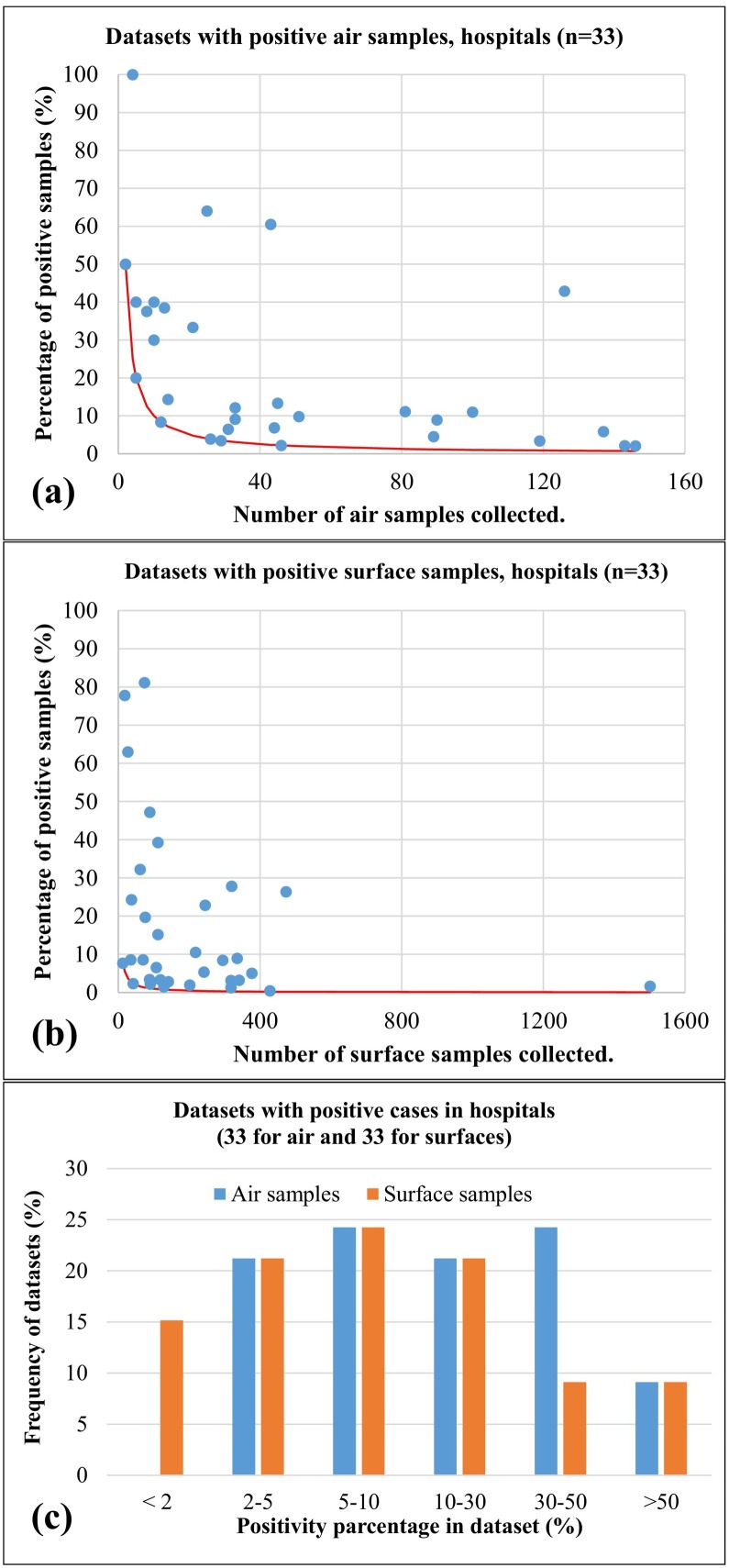
Fig. 4.
Positivity rates as function of the total number of samples collected for the different datasets having positive samples collected in hospitals, care facilities, and quarantine areas. (a) refers to air samples; (b) refers to surface (swab) samples; (c) comparison of frequency distributions of positivity rates for the datasets of air and surface samples collected in hospital and care facilities. Red continuous lines represent the minimum positivity rate (i.e. one positive sample) as a function of the total number of samples. (For interpretation of the references to colour in this figure legend, the reader is referred to the web version of this article.)

