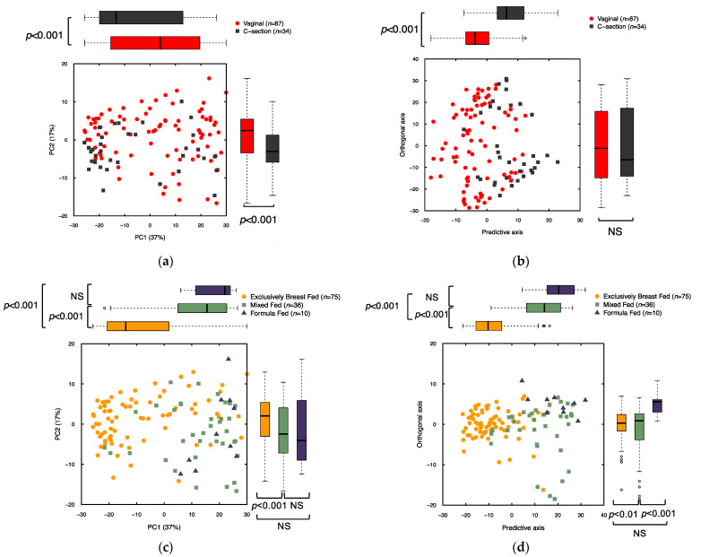
Figure 2.
Comparison of stool metabolome between delivery mode and feeding method groups for n = 121 subjects. (a) PCA of binned NMR data colored by delivery mode. Number of components = 15, Model statistics: R2X = 0.9, Q2 (cum) = 0.46; (b) OPLS-DA of binned NMR data colored by delivery mode. Number of Components = 2 (1 predictive, 1 orthogonal), Model statistics: R2X = 0.55, R2Y = 0.31, Q2 (cum) = 0.14; (c) PCA of binned NMR data colored by feeding type. Number of components = 15, Model statistics: R2X = 0.9, Q2 (cum) = 0.46; (d) OPLS-DA of binned NMR data by feeding type. Number of components = 3 (2 predictive, 1 orthogonal), Model statistics: R2X = 0.58, R2Y = 0.39, Q2 (cum) = 0.18. Individual subjects are represented by points marked according to delivery mode (A and B) or feeding type (C and D). Box plots compare groups along each axis, with the heavy black line indicating the group’s median value, box representing the interquartile range, and whiskers extend to the most extreme point, which is no more than 1.5× the interquartile range from the end of the box. p-values indicate significant differences between groups along individual axes according to Student’s t-test (for 2 independent groups) or ANOVA (for >2 groups and pairwise comparisons; NS indicates not significant).

