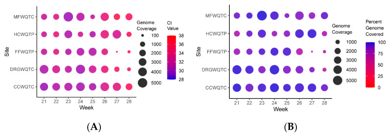
Figure 3.
Quantitative Analysis of Per-Base Genome Coverage and Percent Genome Covered for the Aggregate Wastewater Sites. (A) Shown above is a circle plot depicting the depth of coverage per nucleotide (circle size) and the color of the datapoint corresponds to the Ct value of the associated sample, as detected by qRT-PCR. (B) Similar to that presented in A, but the circle size represents the depth of coverage, and the color of the circle represents the percentage of the genome covered by at least ten reads (circle color). The individual aggregate wastewater sites are listed on the left vertical axis, and the sampling week listed on the bottom horizontal axis.

