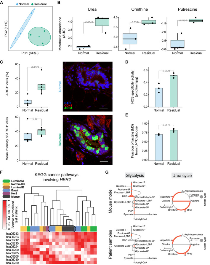
Figure 3. Glycolysis and urea cycle components are the main altered metabolic pathways in residual cells in mice and in human datasets.

- Principal component analysis of extracellular metabolic profiles of isolated healthy (n = 3; blue) and regressed (n = 3; green) mammary glands after cultivation in cell growth medium for 8 h (Materials and Methods). The metabolomic analysis was targeted to central carbon metabolites. Centroids represent the mean, and concentration ellipses represent one standard deviation (level = 0.68) of an estimated t‐distribution based on the first two principal components.
- Selective secreted metabolites with significant change linked to urea cycle components from healthy (n = 3; blue) and regressed (n = 3; green) mammary glands. Values represent metabolite abundance levels as quantified by the area under the curve (AUC) of the marker fragment ions/transitions for each metabolite. Values are plotted on the log2 scale. Statistics were calculated using the limma package (Ritchie et al, 2015) in R with the significance threshold corresponding to a Benjamini–Hochberg‐adjusted P‐value ≤ 0.05 (residual compared to normal).
- Left, Quantification of cells expressing ARG1 (top), an enzyme converting arginine to urea and ornithine, and intensity of ARG1 (bottom) in normal cells from healthy (n = 5, 2,921 cells analyzed; blue) and residual cells from regressed (n = 5, 2,241 cells analyzed; green) mammary gland tissue sections. Statistical differences were calculated with the Mann–Whitney U‐test (Wilcoxon rank‐sum test). Right, Representative images of immunofluorescence staining in normal (top) and residual (bottom) duct stained for ARG1 (green), CDH1 (red), and DAPI (blue). Scale bar: 20 μm.
- Nitric oxide synthase (NOS) activity, an enzyme involved in arginine metabolism, in healthy (n = 3; blue) and in residual (n = 3; green) mouse mammary glands. The difference is statistically significant by unpaired two‐sample t‐test.
- Fractional labeling of lactate after cultivation of isolated regressed (n = 3; green) and healthy (n = 3; blue) mouse mammary glands in cell growth medium supplemented with [U‐13C] glucose for 8 h (Materials and Methods). The three‐carbon labeled (13C) isotopologue (M + 3) of lactate is depicted and shows enrichment in the residual cells of the regressed mammary glands. The difference is statistically significant by unpaired two‐sample t‐test.
- Joint clustering of sample‐wise normalized pathway enrichment test statistics (unpaired one‐side two‐sample t‐test) of mouse model (RNA‐seq; normal, n = 8; residual n = 4) and patient (microarray; healthy, n = 10, regressed n = 20). Clustering is based on all genes of human KEGG pathways (or their mouse orthologs) that involve HER2 and are known to be de‐regulated in cancer (Materials and Methods). Hierarchical clustering with the complete linkage method and the Euclidean distance as a distance metric was used for clustering. For the patient comparison, two independent datasets, one from healthy breast tissue (GSE65194) (Maire et al, 2013; Maubant, Tesson et al, 2015) and one from patient tissues after neo‐adjuvant treatment (GSE32072) (Gonzalez‐Angulo et al, 2012), were merged.
- Metabolic reactions of glycolysis and the urea cycle; differentially expressed (treated patients vs healthy tissue; Benjamini–Hochberg‐adjusted P < 0.1) enzymes are highlighted in red. An empirical Bayes moderated t‐statistic was computed from a gene‐wise linear model fit with generalized least squares (Ritchie et al, 2015), comparing treated patients (n = 4 samples), which cluster closely with the mouse samples (encircled in f), with healthy breast tissue (n = 10 samples). Differential expression data from mouse in vitro transcriptome data of residual vs normal samples (RNA‐seq; normal, n = 8; residual, n = 4) are shown (two‐sided Wald test (Love et al, 2014), Bonferroni‐adjusted P < 0.1).
Data information: (A–F), Numbers of replicates correspond to individual mice or humans. (B, C) Box plots: midline, median; box, 25–75th percentile; whisker, minimum to maximum. (B–E) Numbers marking comparisons (gray lines) show P‐values (corresponding statistical tests are described in individual panel legends).
