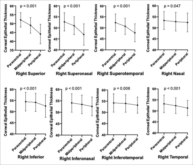
Figure 2.
Dot and Whisker plot depicting the trends in the mean CET values from the paracentral to peripheral sector in each pie segment in the right eye. (Whisker depicts the standard deviation. P value above every plot is computed for the one-way ANOVA comparing the three mean CET values for each pie segment)

