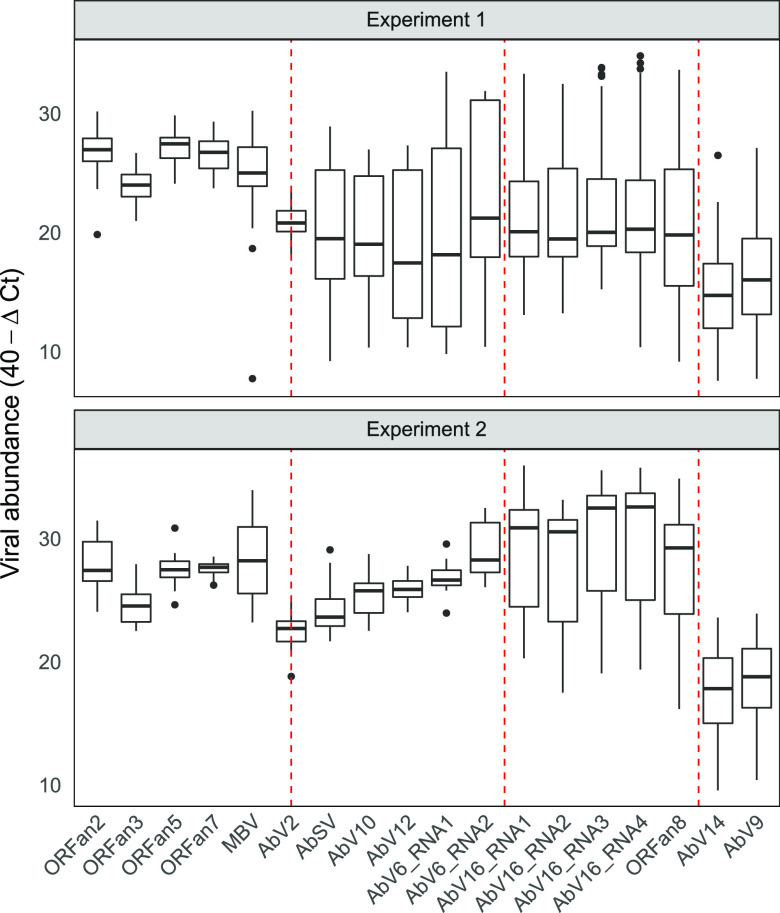
FIG 3.
Distribution of viral population abundance in each experiment. The ΔCT values were transformed to 40−ΔCT values; therefore, higher values indicate higher abundance. RNA abundance box plots show the interquartile range between 25 and 75% of the data. Black bars are the sample medians. Whiskers extend to the largest (upper) and smallest (lower) values within 1.5× interquartile range from the hinge. Other values (outliers) are plotted individually. The vertical dashed red lines delineate the four viral clusters (cluster 1 to cluster 4). AbV2 is bisected due to its uncertain clustering.

