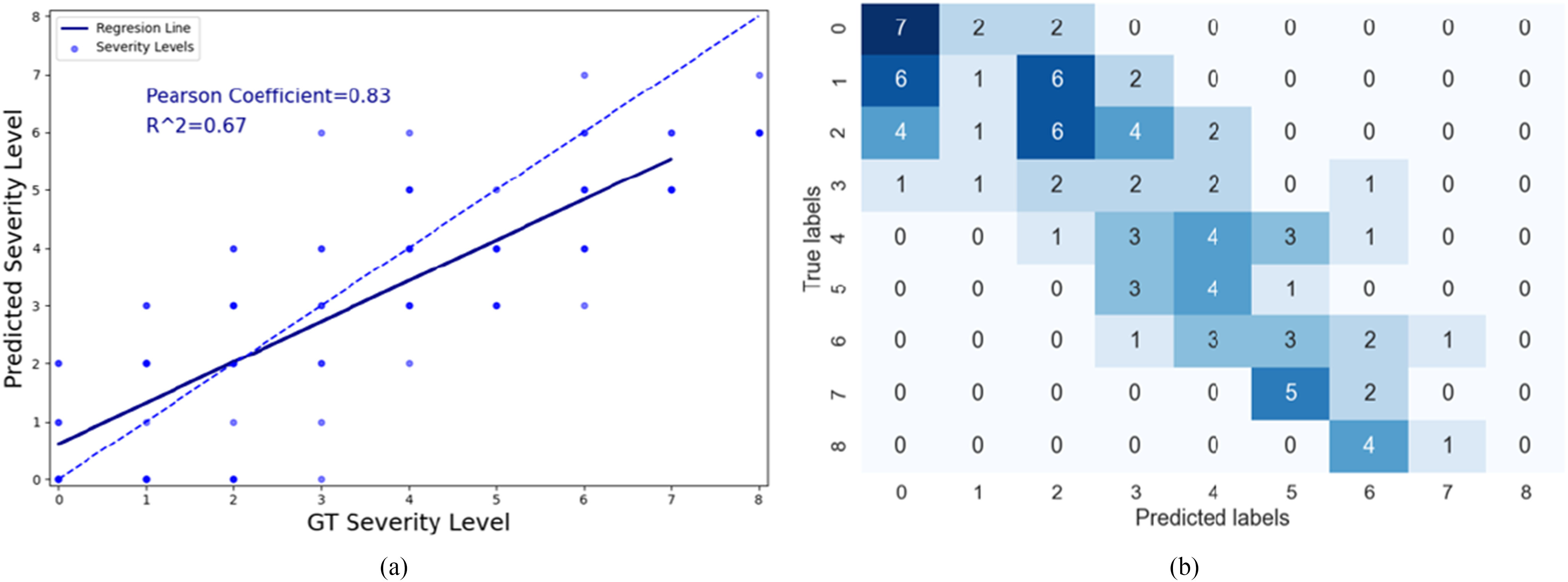
Fig. 10.

(a) Scatter plot showing the relationship between the predicted and GT severity level. The dashed line corresponds to a perfect correlation and the solid blue line shows our linear regression model. (b) Confusion matrix showing the number of images that were scored with different combinations for severity scoring.
