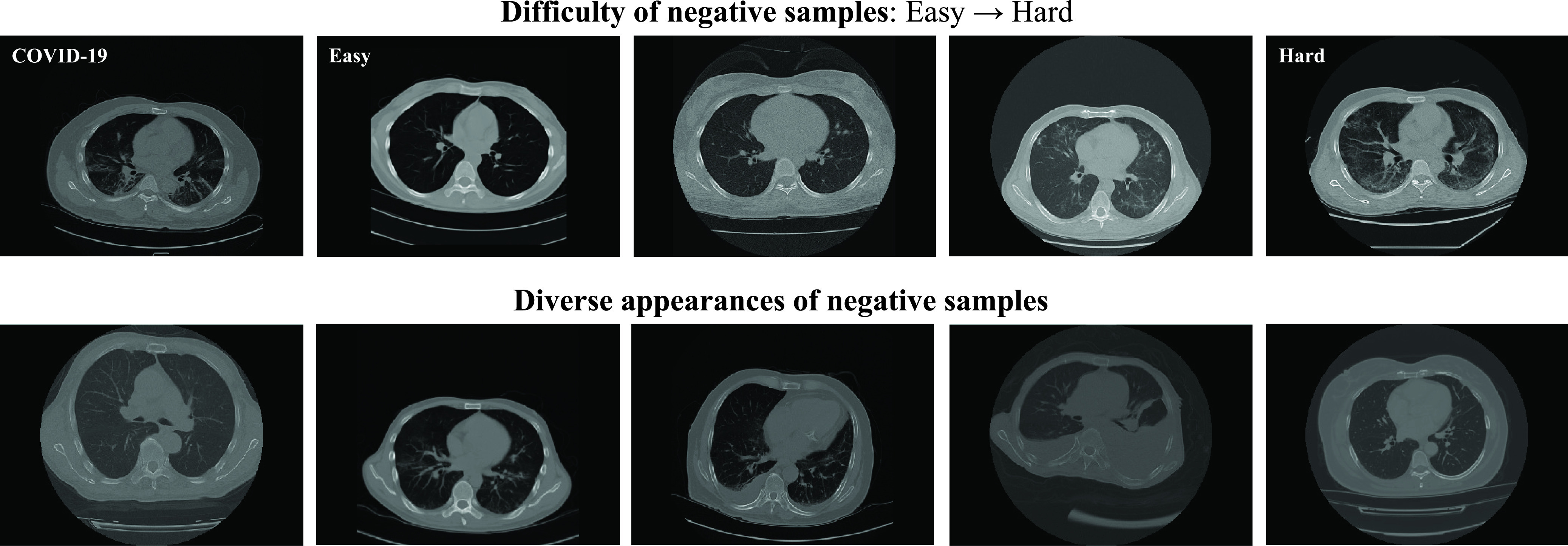
Fig. 3.

Exemplar samples of different levels of difficulty (the first row) and diversity (the second row) selected from the dataset. The COVID-19 sample is presented in the first row for comparison. The difficulty of the samples measured by our  gradually increases from the easy case to the hard case. The appearances of the hard samples are visually close to the COVID-19. The second row presents the negative samples with diverse appearances, which demonstrate the necessity of taking
  into consideration.
