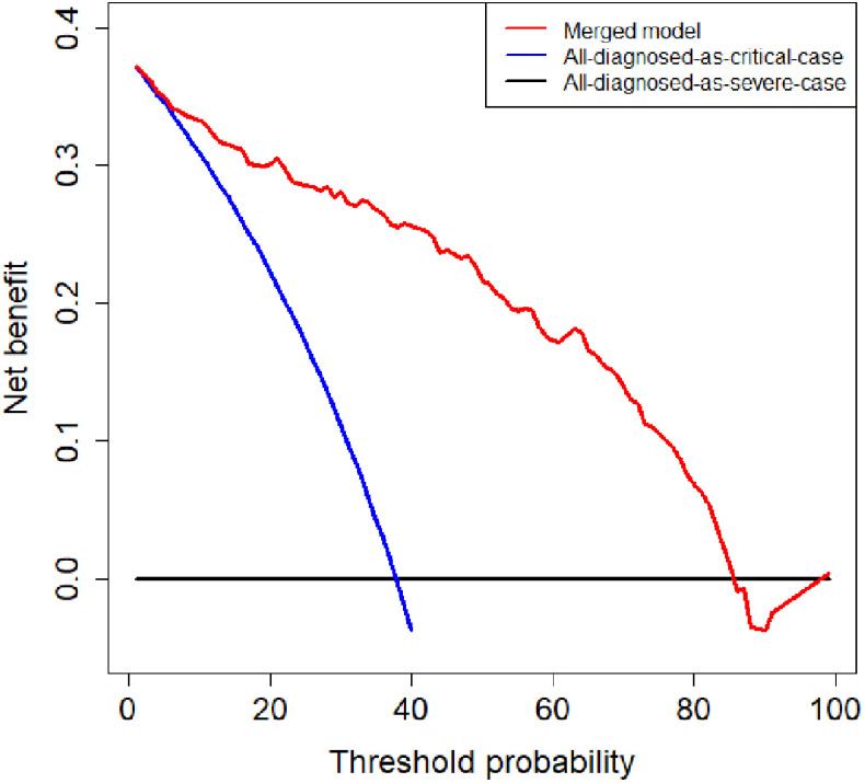
Fig. 8.
Decision curve analysis of the merged model. The red, blue, and black lines represent the merged model, the hypothesis that all patients diagnosed as critical cases, and the hypothesis that all patients diagnosed as severe cases, respectively. The y-axis represents the net benefit. The x-axis represents the threshold probability. The threshold probability is where the expected benefit of further treatment is equal to the expected benefit of avoiding further treatment. For example, if the possibility that patient is critical case over the threshold probability, then further treatment for a critical cases should be adopted.

