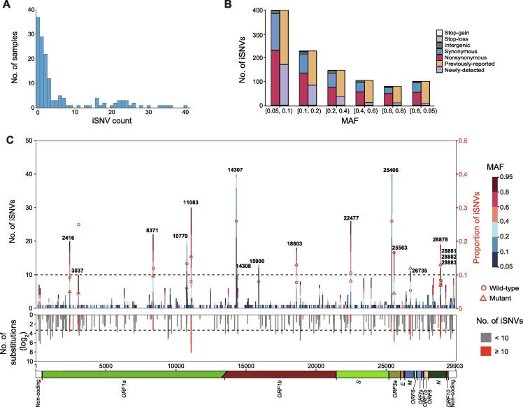
Figure 3.
Profile of iSNVs
A. Distribution of the iSNV count per sample. One sample with iSNV count of 109 is not shown in the bar chart. B. MAF distribution and mutation types of all iSNVs. Bars in orange and purple represent mutations that are observed and not observed in the polymorphism data (as of September 11, 2020), respectively. C. The number and genomic distribution of all iSNVs. In the top plot, the number of iSNVs at each position is plotted as a bar graph against the left Y axis, with MAF of each iSNV color-coded. The dash lines represent iSNV count of 10. Proportion of iSNVs for positions with iSNV count ≥ 10 is plotted against the right Y axis (major allele frequency ≥ 0.7, sequencing depth ≥ 100). Open circle and open triangle indicate wild-type and mutant nucleotides, respectively. In the middle plot, the grey histogram shows the substitution rate estimated from the polymorphism data. Positions with iSNV count ≥ 10 are indicated in red. In the bottom plot, the diagram shows the genomic structure of SARS-CoV-2. Coding regions are color coded with the respective gene names indicated below, and non-coding regions on both ends are shown in blank. iSNV, intra-host single-nucleotide variant.

