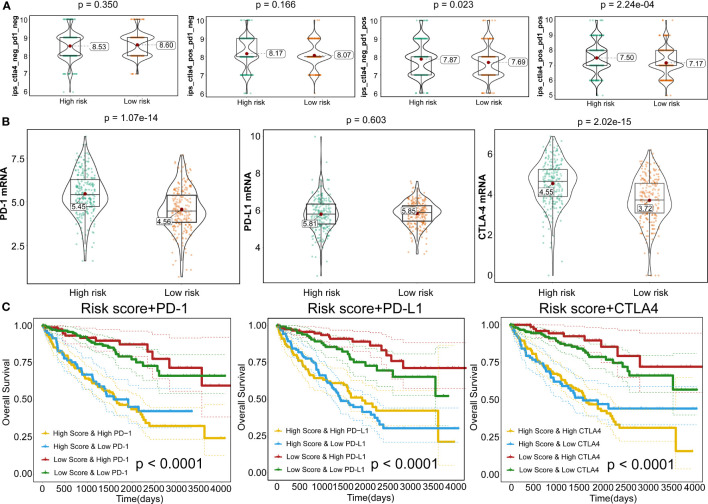
Figure 10.
Responses to immune checkpoint inhibitors. (A) Violin plots illustrate the relative probabilities for anti-PD-1 and anti-CTLA-4 treatment responses between high- and low-risk groups. (B) Violin plots for expression levels of PD-1, CTLA-4, and PD-L1 between high- and low-risk patients. (C) Kaplan–Meier curves for OS outcomes among four groups, according to risk score and PD-1, CTLA-4, and PD-L1.

